This post is co-written by Amanda Regan and Joshua Catalano. It is cross-posted on Mandy’s blog.
 Two weeks ago, Amanda Regan and I participated in the Collections as Data Hack-to-Learn event sponsored by the Library of Congress, George Washington University, and George Mason University. For the event, George Washington University, the Library of Congress and the Smithsonian provided participants with a series of datasets. The corpus that we gravitated toward included all of Eleanor Roosevelt’s My Day columns. During the workshop, we ran a 60 topic model on the columns. Due to time constraints and technical challenges during the workshop we were not able to accomplish much beyond creating the topics. The dataset, composed of almost 8,000 columns, resulted in large files that required manipulation with a tool such as R in order to create visualizations and analyze the results. This made it difficult for participants to do much with the topic modeling results during the workshop. Over the last two weeks, we have worked to take the topic model, manipulate the results, and create an interactive app with several visualizations that allows for an exploration of the topic model. This blog post will detail some of the process of making this visualization and describe how it might be used and interpreted.
About Eleanor Roosevelt’s My Day Columns
From December 1935 until September 1962, Eleanor Roosevelt wrote a nationally syndicated newspaper column entitled My Day. Because Roosevelt did not keep any sort of diary and her appointment books were often incomplete, the “My Day” columns have become a valuable source. The columns, authored six days a week until January 1961 and then three days a week thereafter, represent the only consistent account of her public activities. Thanks to the work of the Eleanor Roosevelt Papers’ staff, who transcribed each My Day column and made them available online, anyone with internet access can now explore this important piece of history.
The online repository of My Day columns allows users to look for columns by year or find a particular word or phrase within the collection through keyword search. Keyword search however, requires a level of specificity and familiarity with the topics discussed within the archive. A topic model allows for a more thematic and interactive way of exploring the archive. Providing a thematic overview, a topic model allows users a different entry point into the archive generated by the content (words) of the documents rather than a predetermined organizing schemata such as Library of Congress subject headings or even keywords.
Preparing the Data, Generating the Topic Model, and Creating Visualizations
Each file, originally in XML, contained not only the date and text of the column, but a location where the column was written. Using these documents, we wrote a parsing script in R that created a csv of all the related metadata and then created a text file of the column text. The script identified the column date, location name, and geolocation in each article and wrote it to a csv along with each filename. This created a base metadata file. Next, the script went through each xml file and pulled out just the plain text of the column and wrote it to a text file.
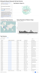
We used MALLET to divide all of the 7,987 My Day columns (as plain text files) into 70 “topics.” Each “topic” is a set of words that frequently co-occur together throughout the corpus. These words indicate themes or discourses within the corpus. With Python and R, we then transformed the MALLET output into several different types of visualizations using Shiny and a number of other packages. The benefit of using Shiny is that it allows users to change specific input parameters such as the topic, number of words, and the number of documents to display. The resulting app includes a word cloud representing the top words in the topic, a chart depicting the prominence of the topic over time, a map detailing the locations where the most prominent columns in the topic were written, and a list of the prominent columns in the topic (with a link to the text). Additionally, a tab at the bottom of the page allows users to view the top words in all 60 topics. Below are descriptions of each section of the visualization.
- Top Words in Topic: The Word Cloud displays the topic as a distribution of words. The larger the word, the more frequently it appeared in the topic.
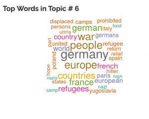
- Yearly Proportion of Words in Topic: This time series chart depicts the topics prominence over time. The y-axis is the yearly proportion of words in the corpus belonging to that topic and the x-axis is the year. This view provides an estimation of the concentration of particular topics in certain years. For example, Topic 6, about refugees in the years following World War II, spikes between 1946 and 1948. Users can use the Top Columns chart to investigate further and track down the individual columns where this topic is prevalent.
- Locations of Top Columns: Each My Day column includes a location that indicates where Roosevelt was when it was written and published. This map reflects Roosevelt’s location for the top 30 documents in a topic.
- Top Columns: This chart contains the metadata for the top 30 columns associated with a topic and a link to the original column on the Eleanor Roosevelt Papers website.
Interpreting the Visualization
 Looking at the resulting visualization, we can get a sense of the themes and discourses that exist within the My Day corpus. For example, Topic 6 (fig 1) includes the words germany, europe, war, people, countries, french, country, and refugees. Looking at the proportion of words in the topic over time, it is clear that the topic spikes between 1946 and 1948. This cluster of words or topic corresponds to a period of time beginning in December 1945 when Eleanor Roosevelt served as a delegate to the United Nations and later as the first chairperson of the United Nations Commission on Human Rights. The words contained in this topic reflect her work serving in this capacity and are gleamed from the reports and comments she made following her visits to refugee camps. Topic 20, another similar topic, is also about Roosevelt’s work with the United Nations but, upon closer inspection it is revealed that the topic is particularly about Roosevelt’s work as the Chair of the Commission on Civil Rights. The spikes in 1948 and 1949 correspond with the United Nation’s adoption of the Universal Declaration of Human Rights in December 1948.

Another example that speaks to the potential of topic modeling as a tool for exploring themes in a corpus is topic 30. The top words “christmas year children birthday family season party day friends eve cards gifts presents tree joy happy good gift child” are clearly about holidays, birthdays, and festivities. Almost all of the most heavily associated documents were written in December just before or after the Christmas holiday. Roosevelt often described family traditions and gatherings such as singing Christmas carols or decorating for the holidays. For example, she once recounted thinking as she drove into New York City “how lovely [the] modern electric lighting can make Christmas in the city.” (Roosevelt, 12/24/1938) The few relevant articles in this topic that were not written in December discuss other celebrations or birthdays.
Topic modeling is also a useful way to locate sources relating to a particular research interest. For example, a researcher interested in religion would quickly recognize it as the theme of Topic 14 and would be able to efficiently identify the 30 documents most likely to discuss the subject and where and when they were composed.
This visualization offers yet another entry point into the Eleanor Roosevelt My Day columns and allows users who may not be intimately familiar with the content of these columns a way to sift, filter, and identify themes and discourses of interest within the corpus and direct them back to the original source material.
You can see the code on github. The visualization is available here.
Very interesting Josh!